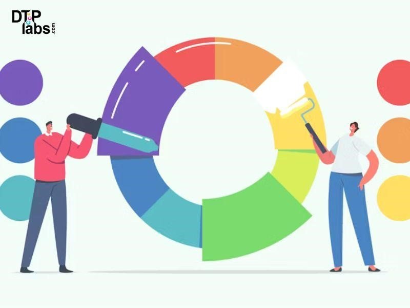
How Does Color Contrast Affect PDF Design?
Colour contrast plays a crucial role in PDF design as it directly impacts readability, accessibility, and overall user experience.
Here’s how it affects PDF design:
- Readability: High colour contrast between text and background enhances readability, making it easier for readers to discern letters and words. When designing PDFs, ensure that text colours contrast well with the background colour to avoid strain on the eyes.
- Accessibility: Good colour contrast is essential for accessibility, particularly for people with visual impairments or colour vision deficiencies. Using colours with sufficient contrast ensures that content is accessible to a wider audience, including those who may have difficulty distinguishing between certain colours.
- Visual Hierarchy: Colour contrast can be used to establish a visual hierarchy within the PDF, guiding the reader’s attention to important elements such as headings, key points, or call-to-action buttons. By adjusting the contrast between different elements, designers can create a more organized and intuitive layout.
- Branding and Aesthetics: Colour contrast is also integral to maintaining brand consistency and creating visually appealing designs. Consistent use of colours with appropriate contrast can reinforce brand identity and evoke desired emotional responses from the audience.
Why Is Appropriate Colour Contrast Crucial?
One common mistake in document design is using poor colour contrast and text fonts. It can make it complicated for readers to distinguish between different elements of the document, leading to eye strain and confusion.
Colour contrast between the text and background is important in PDFs. Colour contrast issues can hinder certain individuals’ ability to visually perceive information, making it difficult for them to receive the content effectively. The goal of PDF Accessibility is to ensure that information is equally accessible to all users, regardless of ability, by adhering to accessibility standards and guidelines.
Everyone who can see things does so in different ways. The human eye and brain are very good at distinguishing shapes, patterns, and colours generally, but for a large number of people, there can be difficulties distinguishing some shades, or some colours. The term often used to describe this is colour blindness.
Two issues require attention:
- Any information conveyed through colour should have an alternative method of differentiation.
- The text must be legible, and other elements must be distinguishable by having adequate contrast with the background.
This isn’t just for people with issues like colour blindness, it affects everyone in different ways:
- As part of the natural ageing process, there is a decrease in the amount of light that reaches the retina at the back of the eye.
- Computer monitors and TV screens vary widely in size, resolution, and contrast.
- Reading becomes more challenging in bright conditions due to reduced contrast.
There is no actual restriction in the use of colour in a document, with the exception that some colours may not be a good choice when we discuss proper contrast. What this means is that you cannot use colour alone to represent important information, determine a response or represent visual content.
What Are Color Contrast Issues?
One of the most common issues that hold back the accessibility of PDF documents is the insufficient colour contrast of text. Colour contrast in documents needs to be high enough so that people with colour blindness or difficulty seeing can still read the document.
Occasionally, a PDF may be too dim for readability. This is a frequent occurrence, particularly when the PDF is scanned, resulting in darker appearing pages.
Contrast can be an issue on PDFs, especially on scanned documents. Not that the document itself is an issue, but there are moments when the scanned pages have fallen out or aged so badly that the content can be hard to read because of that. The positive aspect is that you can adjust the contrast of the PDF and increase it, enabling easier reading without straining your eyes.
Common colour contrast issues in design include:
- Low Contrast: When the contrast between text and background colours is too low, it becomes difficult for readers to distinguish the text, leading to poor readability and accessibility issues.
- Insufficient Contrast: Inadequate contrast between different elements within the design, such as between foreground and background colours or between various graphical elements, can result in confusion and make it challenging for users to perceive important information.
- Colour Blindness: Ignoring the needs of colour-blind individuals can lead to issues where important information or elements are conveyed solely through colour differences. Designers should ensure that important distinctions are also discernible through other means, such as text labels or patterns.
- Clashing Colours: Poorly chosen colour combinations can result in colours that clash or compete with each other, causing visual discomfort and making the content harder to read or understand.
How To Avoid Them?
To avoid colour contrast issues in PDF accessibility, follow these guidelines:
- Use Sufficient Contrast: Ensure that there is enough contrast between text and background colours According to the Web Content Accessibility Guidelines (WCAG), normal text should have a minimum contrast ratio of 4.5:1, while large text (18pt or 14pt bold) should have a ratio of at least 3:1. Use online contrast checking tools to verify contrast ratios.
- Avoid Relying Solely on Colour: Don’t convey important information or distinctions solely through colour. Use other visual cues like text labels, patterns, icons, or shapes to ensure that information is accessible to individuals with colour vision deficiencies.
- Test Across Various Devices and Environments: Colours may appear differently on different screens and under different lighting conditions. Test your PDF across multiple devices, including computers, tablets, and smartphones, to ensure consistent and effective colour contrast.
- Consider Colour Blindness: Be mindful of users with colour vision deficiencies (colour blindness). Choose colour combinations that are distinguishable to individuals with various types of colour blindness. Tools like Colour Blindness Simulator can help you simulate how your design appears to people with different types of colour vision deficiencies.
DTP Labs is a Desktop Publishing company based in New Delhi, India. We offer book publishing Services, PDF to Word conversions, post-translation DTP, and E-Learning Localization Services to translation agencies worldwide. To avail of our services, check out our website www.dtplabs.com, or contact us at info@dtplabs.com.