In multilingual desktop publishing (DTP) projects, managing fonts is one of the most important tasks to ensure a polished and professional result. Fonts play a key role in how text looks and feels. Choosing the right fonts can make the content clear, easy to read, and visually appealing across different languages. However, working with various languages introduces challenges such as font compatibility, readability, and cultural nuances. This blog explores some best practices for managing fonts in multilingual DTP projects, ensuring a seamless workflow and quality output.
Choosing Fonts That Support Multiple Languages
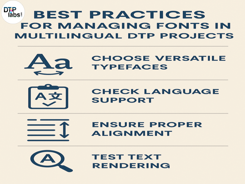
One of the first steps in multilingual DTP projects is selecting fonts that support all the required languages. Many standard fonts do not include characters for non-Latin scripts like Chinese, Arabic, or Hindi. Using fonts with extensive language support, such as Arial Unicode MS or Noto, can save time and prevent errors.
Fonts should also align with the tone and purpose of the content. For instance, a formal document may need a clean, professional typeface, while creative content can use more expressive fonts. Testing how the chosen fonts handle different characters, accents, and symbols ensures that the text will display correctly.
Maintaining Readability and Accessibility
Readability is crucial, especially when dealing with languages that have complex scripts or require specific spacing. Fonts that are too decorative or tightly spaced can make the text hard to read, particularly for scripts like Devanagari or Arabic.
It’s also important to consider font size. Scripts like Chinese or Japanese may need slightly larger font sizes than English to ensure clarity. On the other hand, languages like German may require more horizontal space due to longer words. Adjusting these factors improves accessibility for a global audience.
Consistency Across Languages
Consistency is key in multilingual projects. Using different fonts for each language can disrupt the overall design and reduce visual harmony. Whenever possible, select a font family that supports all languages to maintain a uniform look.
For situations where multiple fonts are necessary, ensure they complement each other in style. For example, pairing a sans-serif font for English text with a sans-serif font for non-Latin scripts can create a cohesive appearance.
Testing for Font Compatibility
Before finalizing a project, thorough testing is essential. Fonts that look good in one software may not render properly in another. Open the document in all required tools, including Adobe InDesign, Microsoft Word, and any translation software, to check compatibility.
Pay attention to issues like text overflow, misaligned characters, or missing glyphs. Catching these problems early avoids last-minute fixes and ensures a smooth workflow.
Embedding Fonts for Seamless Sharing
When sharing files with clients, translators, or printers, embedding fonts is a best practice. This guarantees that the fonts will display correctly, even if the recipient doesn’t have them installed on their system.
Most design software, like Adobe InDesign, provides an option to embed fonts in PDFs or package them with the project files. Doing this minimizes the risk of layout shifts or font substitutions during review and printing.
Respecting Cultural Nuances
Fonts can carry cultural connotations. For instance, a font that feels modern and professional in one culture may seem informal or unsuitable in another. Understanding cultural preferences ensures that the chosen fonts appeal to the target audience effectively.
For example, while serif fonts are often seen as traditional in Western countries, they may not be appropriate for modern content in East Asian languages. Consulting local experts or translators can provide valuable insights into font choices for specific regions.
Simplifying Updates and Edits
Multilingual projects often involve updates or edits after the initial layout. Using a well-organized font library makes it easier to handle these changes. Label fonts clearly, group them by language or project, and ensure they are accessible to the entire team.
Sticking to a limited set of fonts across all projects also reduces the complexity of file management. It allows for quicker updates and ensures consistent branding.
Conclusion
Managing fonts effectively in multilingual DTP projects requires careful planning and attention to detail. By choosing fonts with wide language support, ensuring readability, and maintaining consistency, you can create designs that work seamlessly across languages. Testing for compatibility, embedding fonts, and respecting cultural nuances further enhance the quality of your projects. With these best practices, you can handle the complexities of multilingual DTP with confidence, delivering results that meet the needs of global audiences.
DTP Labs is a desktop publishing company based in New Delhi, India. We offer book publishing Services, PDF to Word conversions, post-translation DTP, and e-Learning localization services to translation agencies worldwide. To avail of our services, check out our website www.dtplabs.com, or contact us at info@dtplabs.com.